To start this thesis project I had to determine what an accessible UI could look like. To do this I did both research on different UI and started blocking what a simple UI could be.
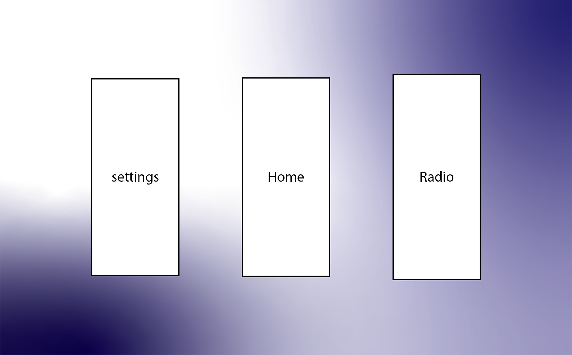
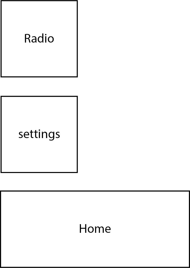
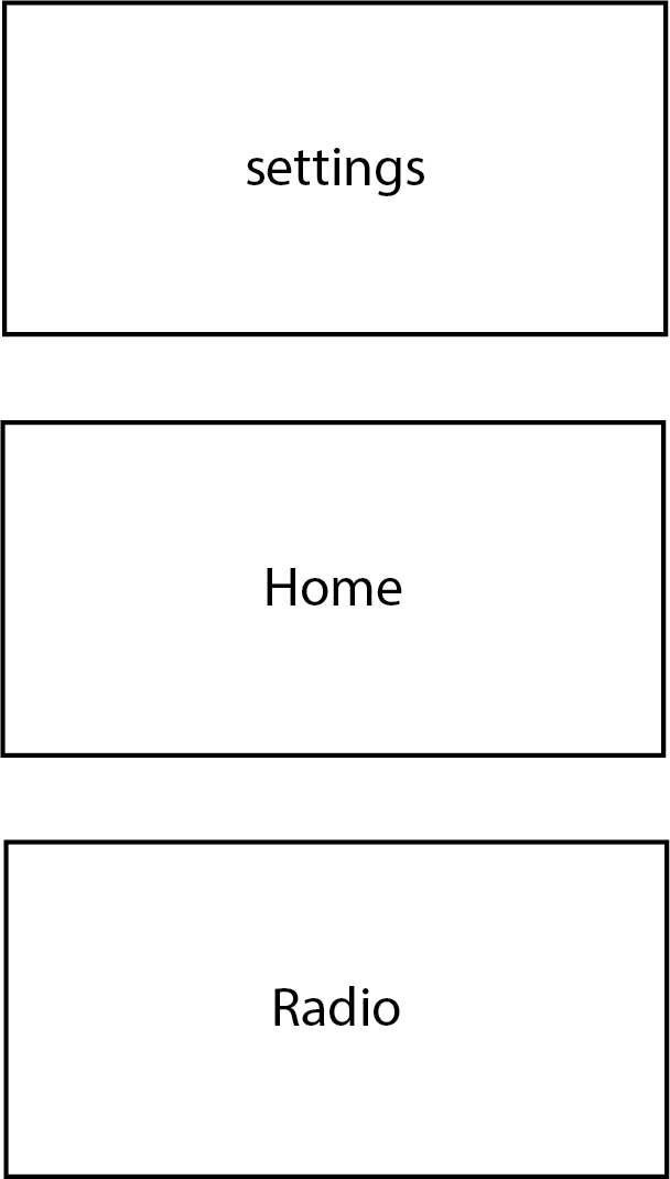
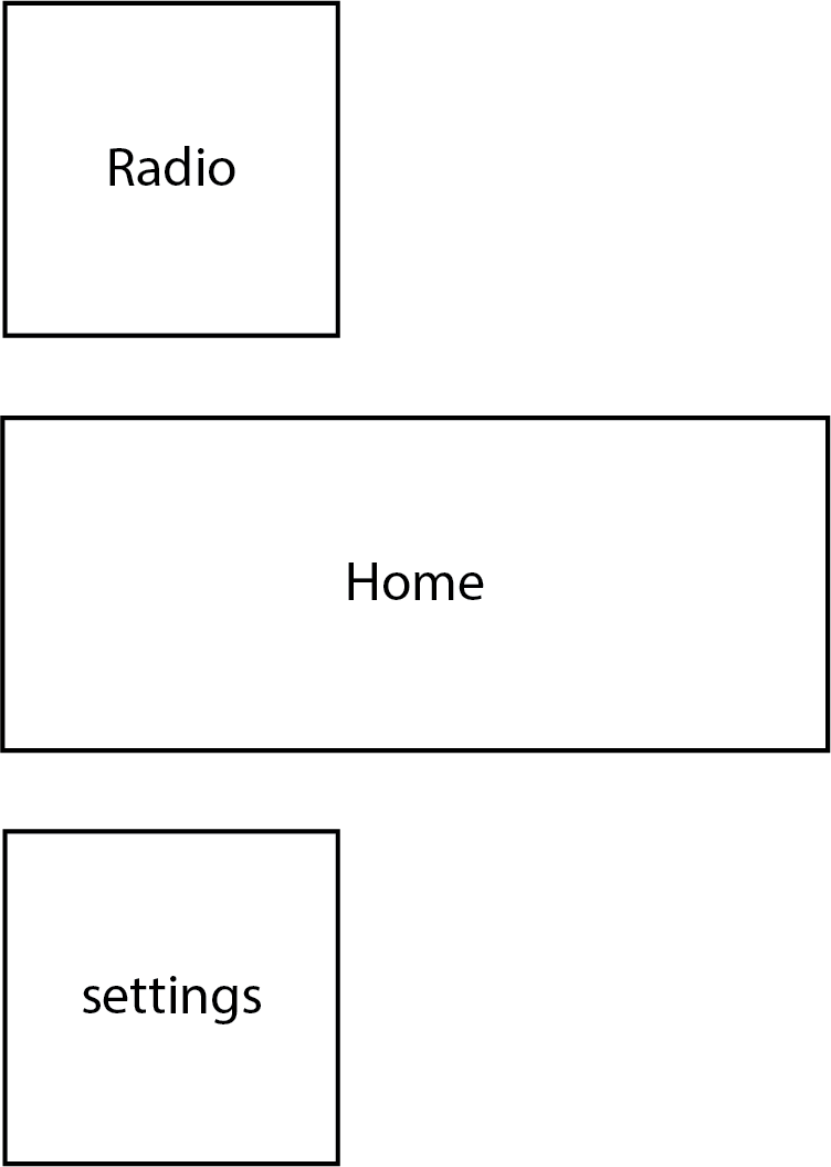
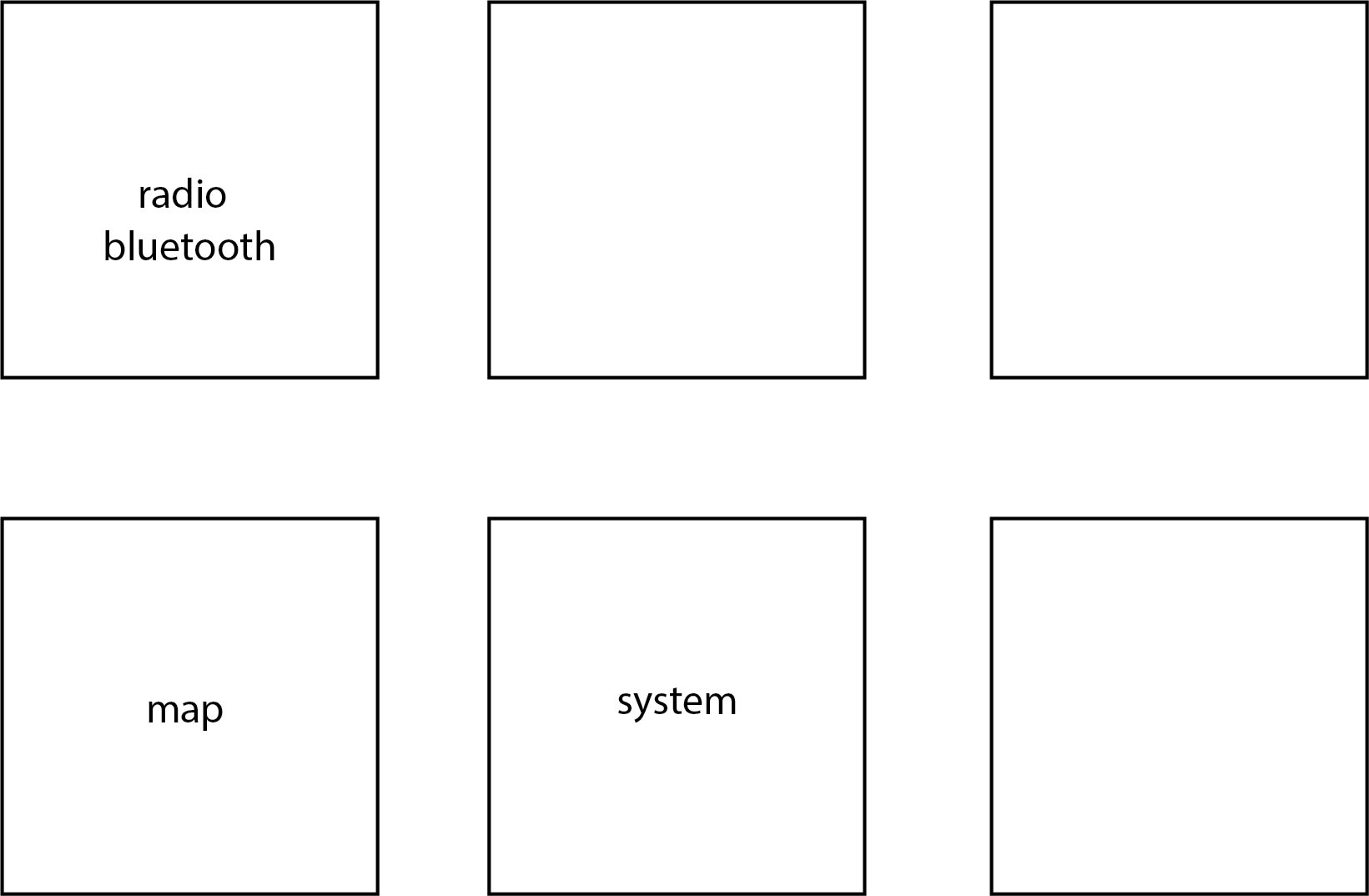
This blocking is more of an exercise I did to help figure out what the size of the buttons should be.
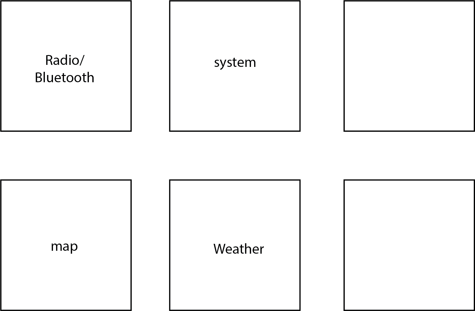
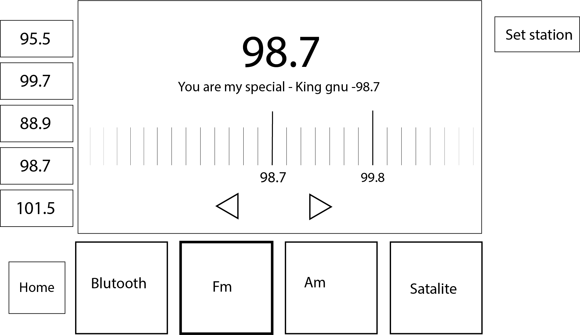
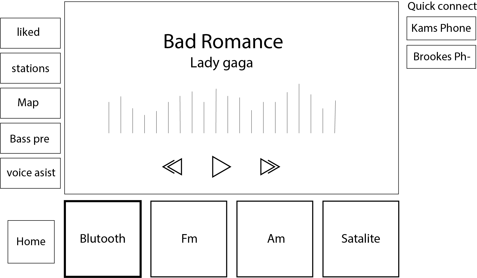
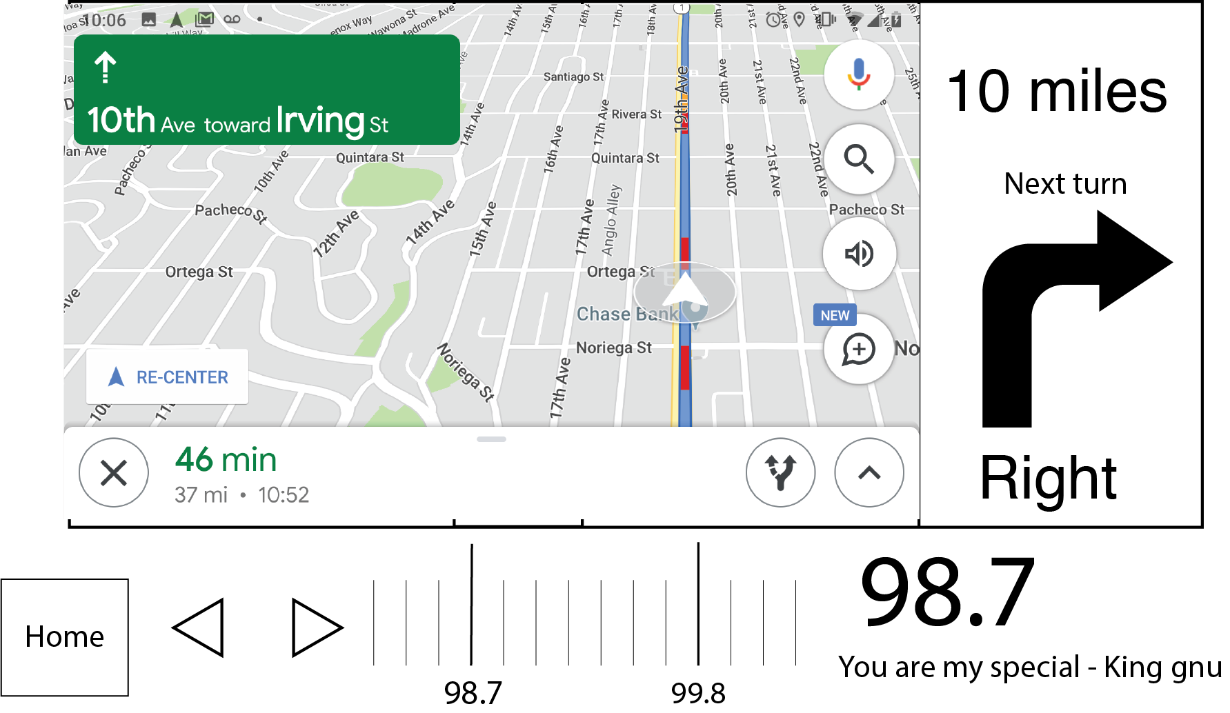
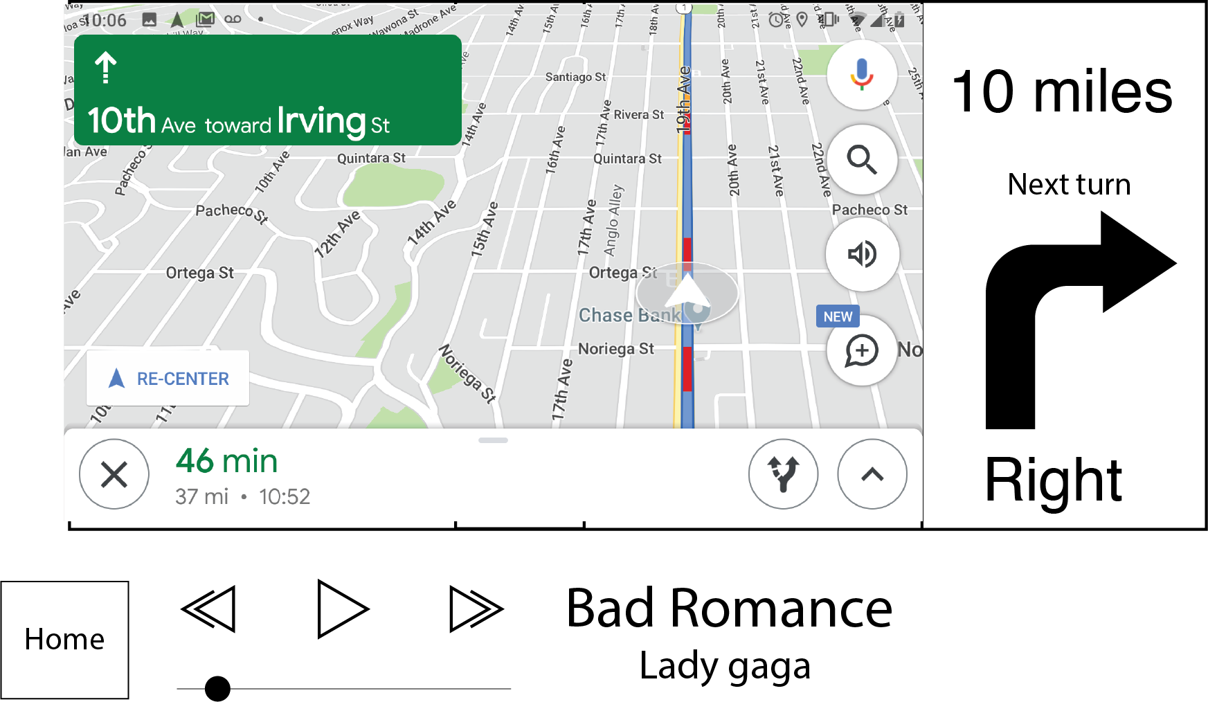
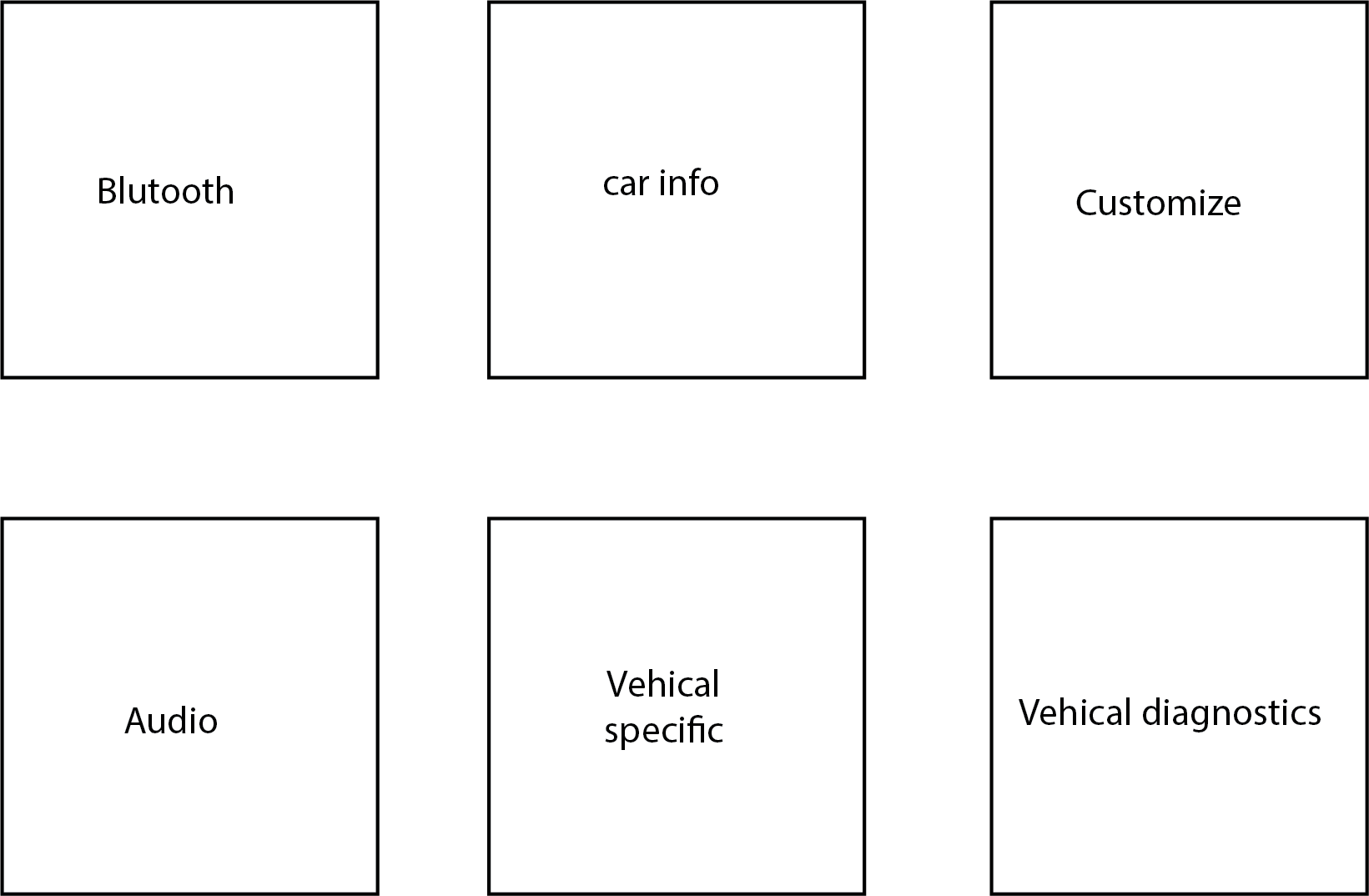
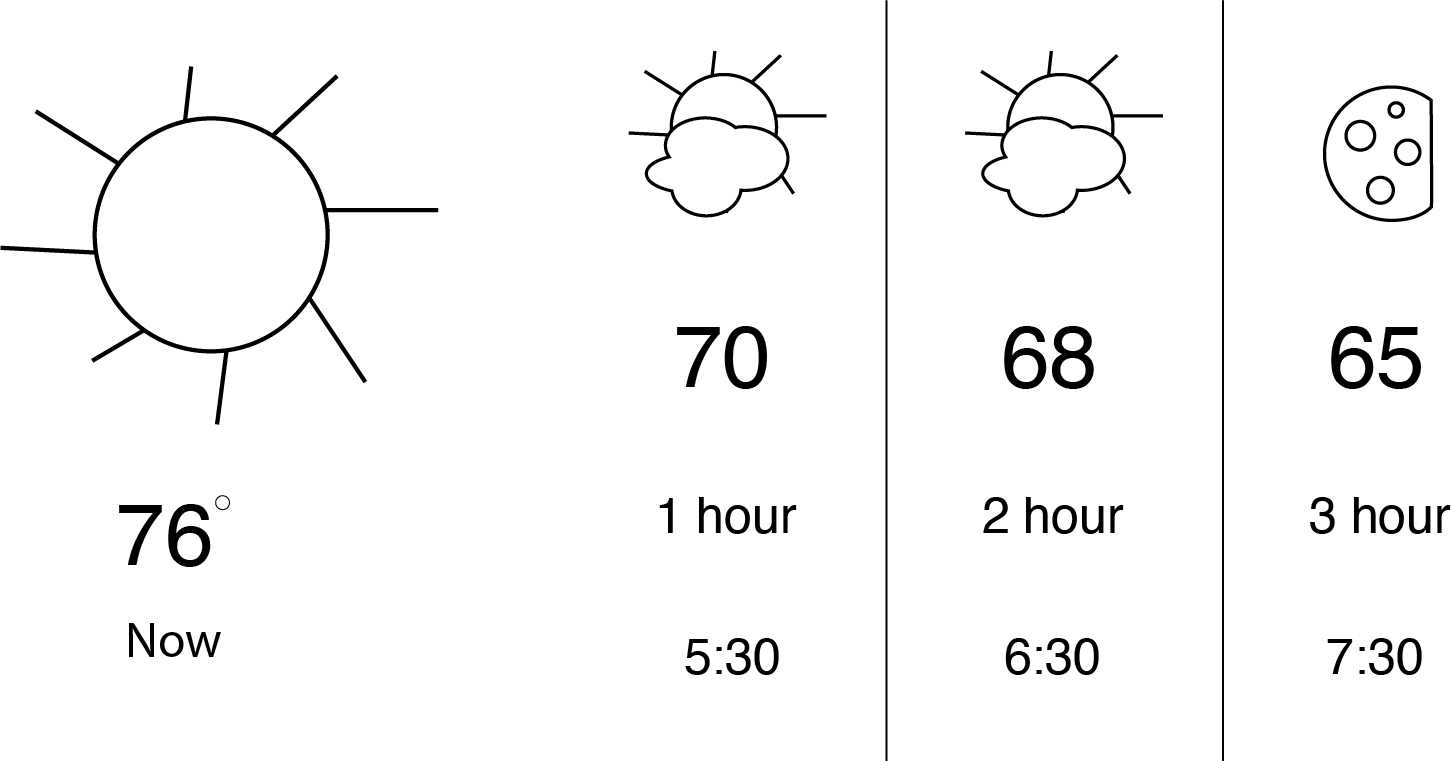
After the blocking, I went ahead and made a simple Ui where I added basic text and icons. This served as a test, where I then asked fellow designs for feedback and opinions on what they liked and disliked.
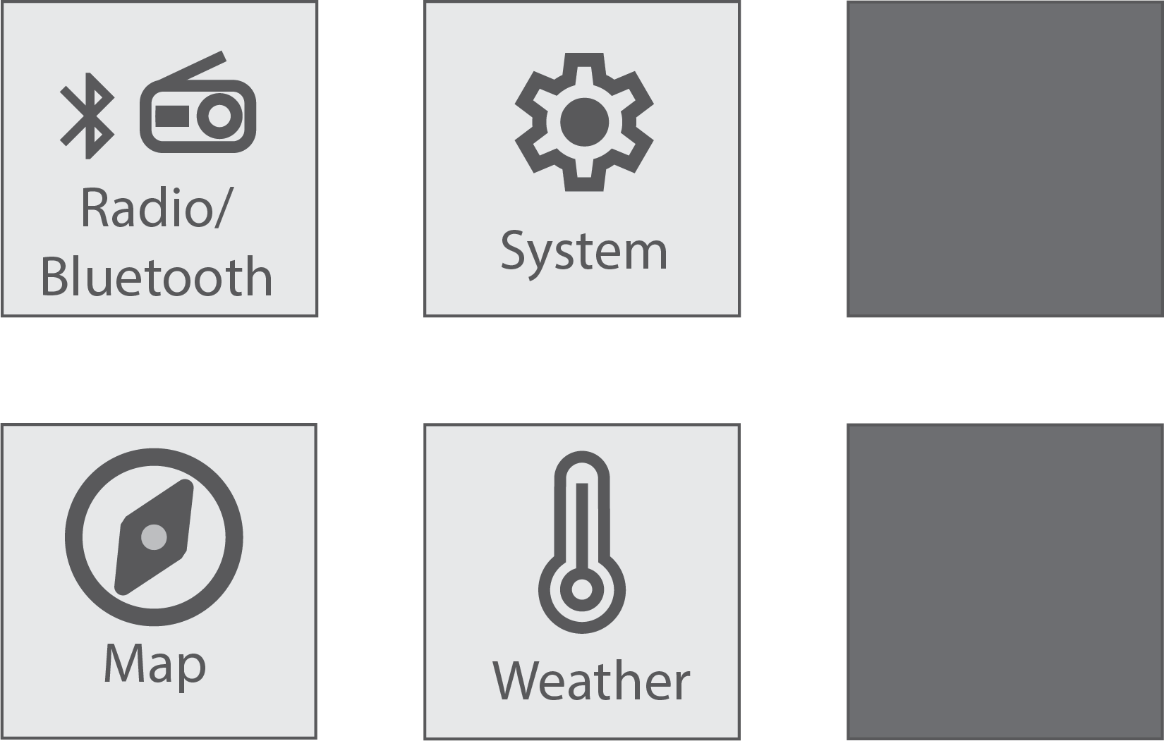
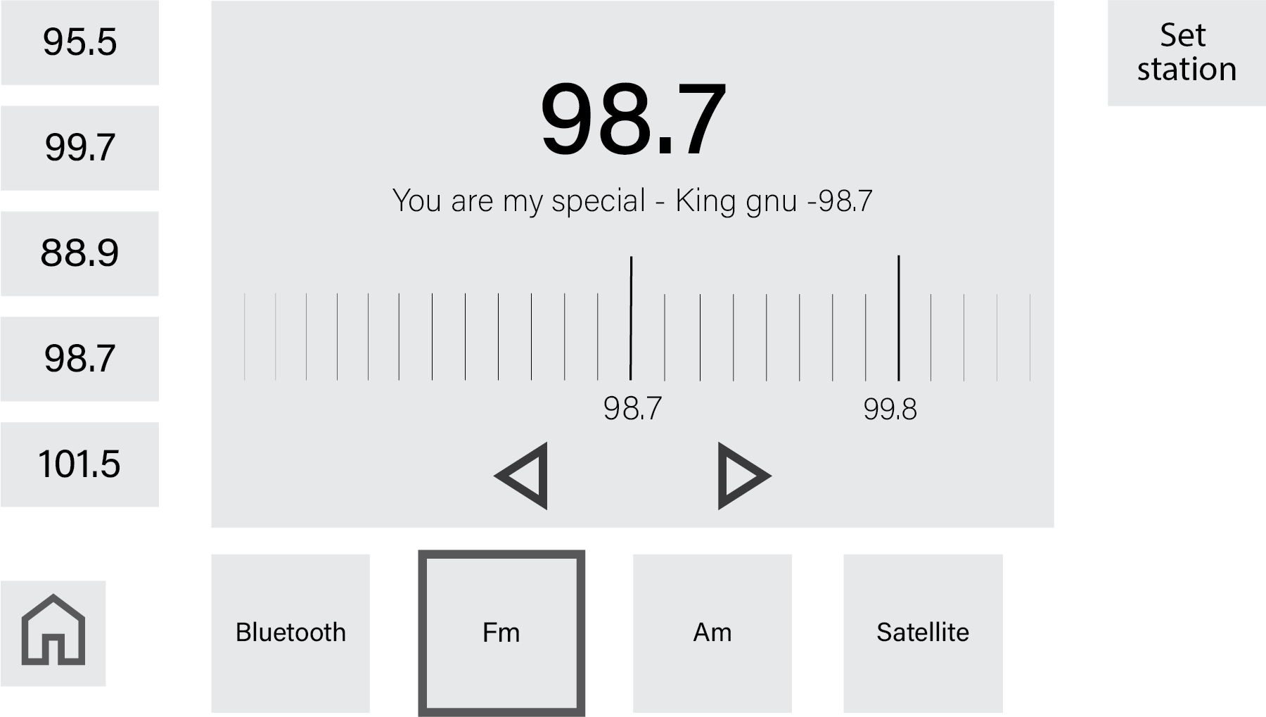
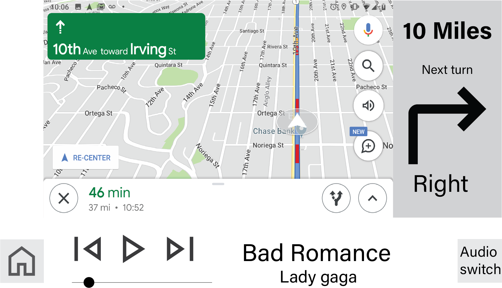
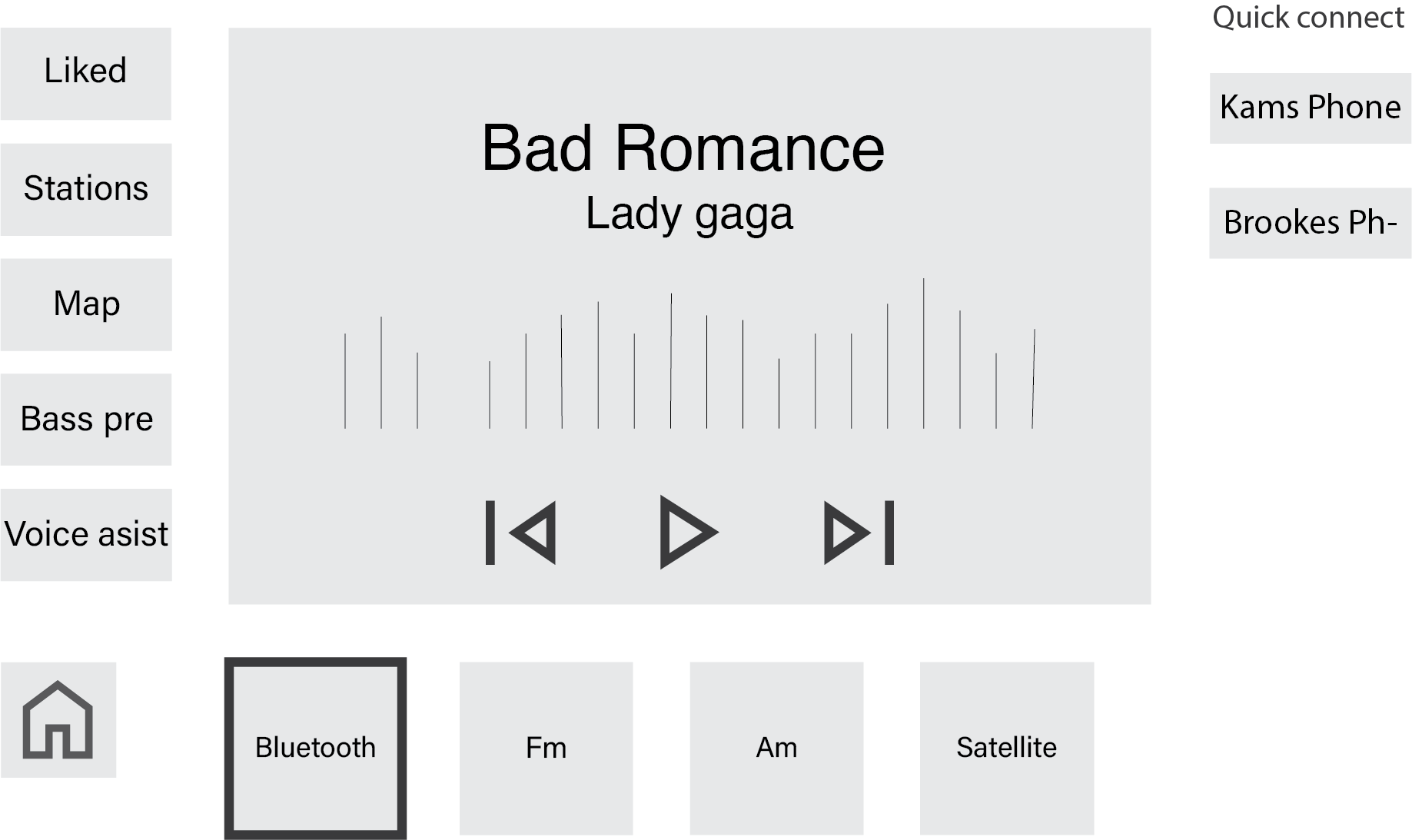
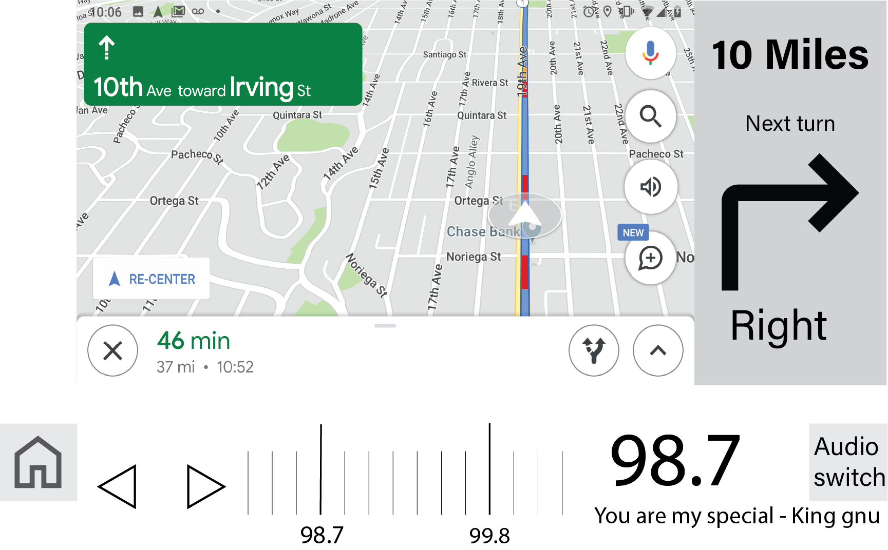
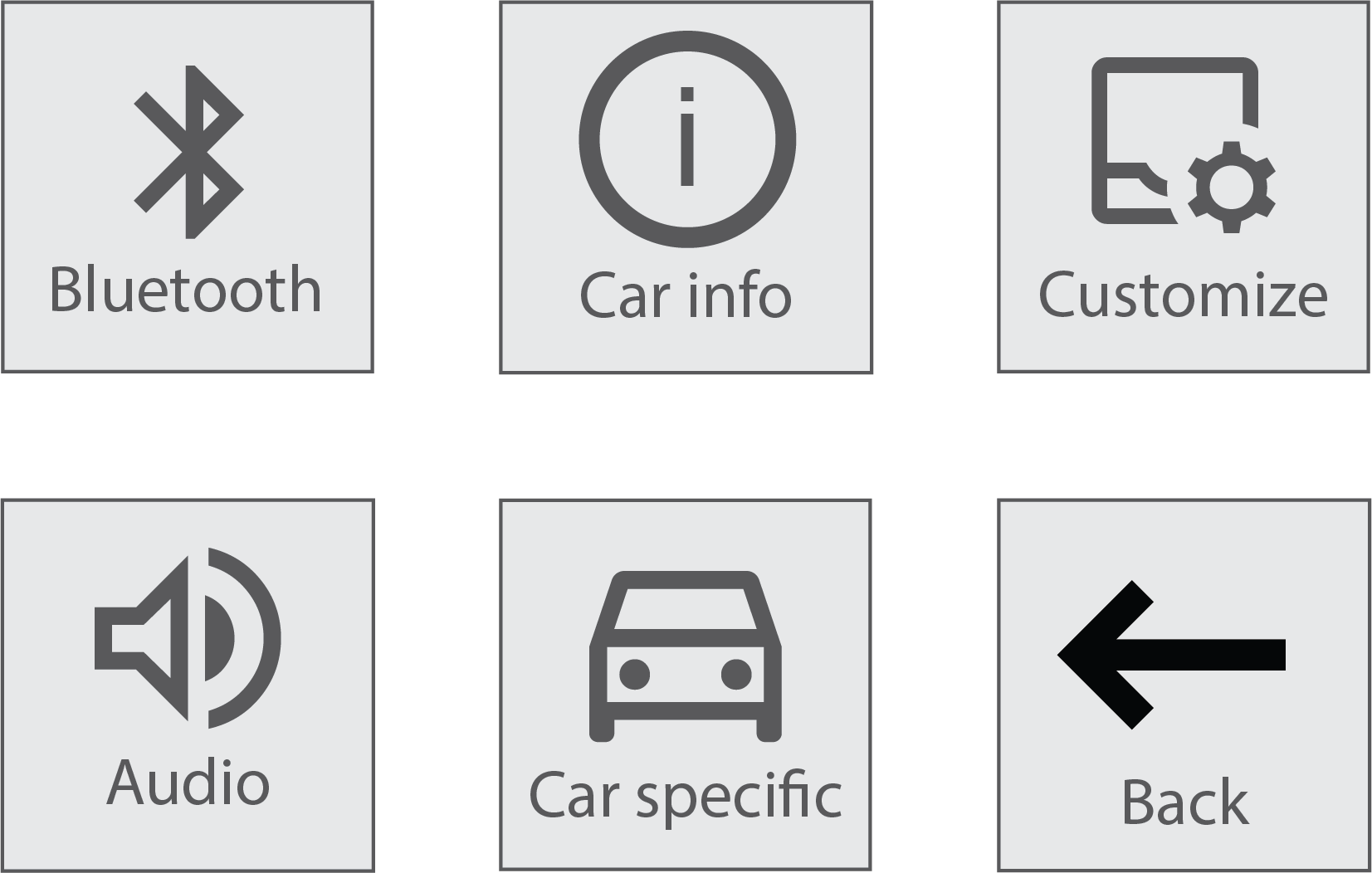
After the simple blocking I went ahead and introduced icons, refined typeface, and grayscale to the Ui. The icons are a combination of Googles open icon packs for android and some handmade ones to match the aesthetic.
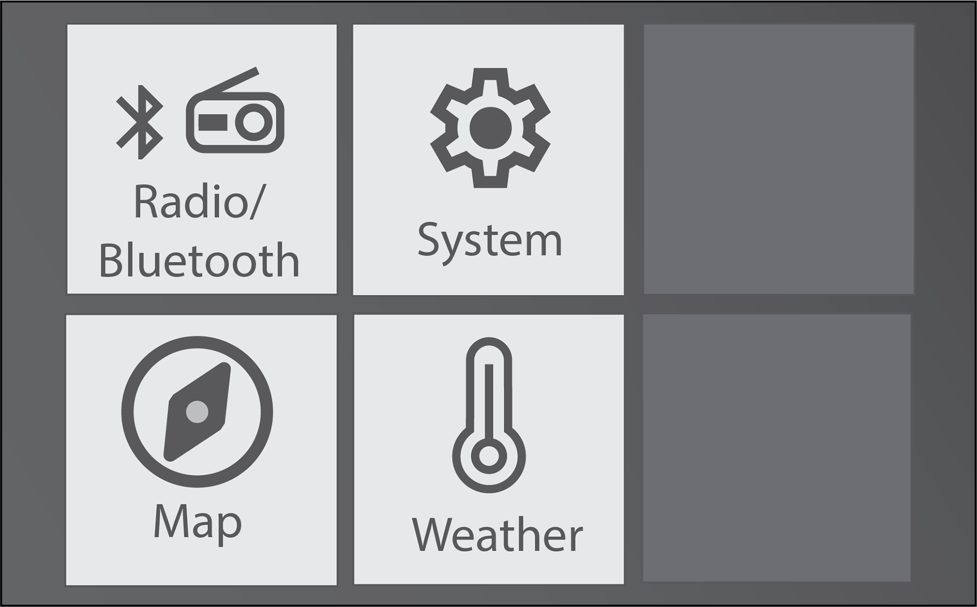
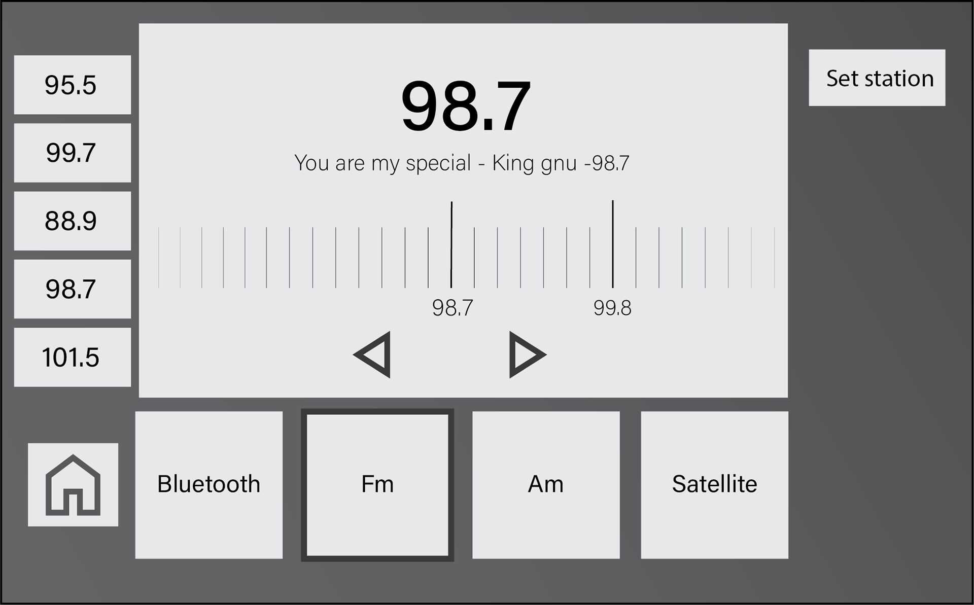
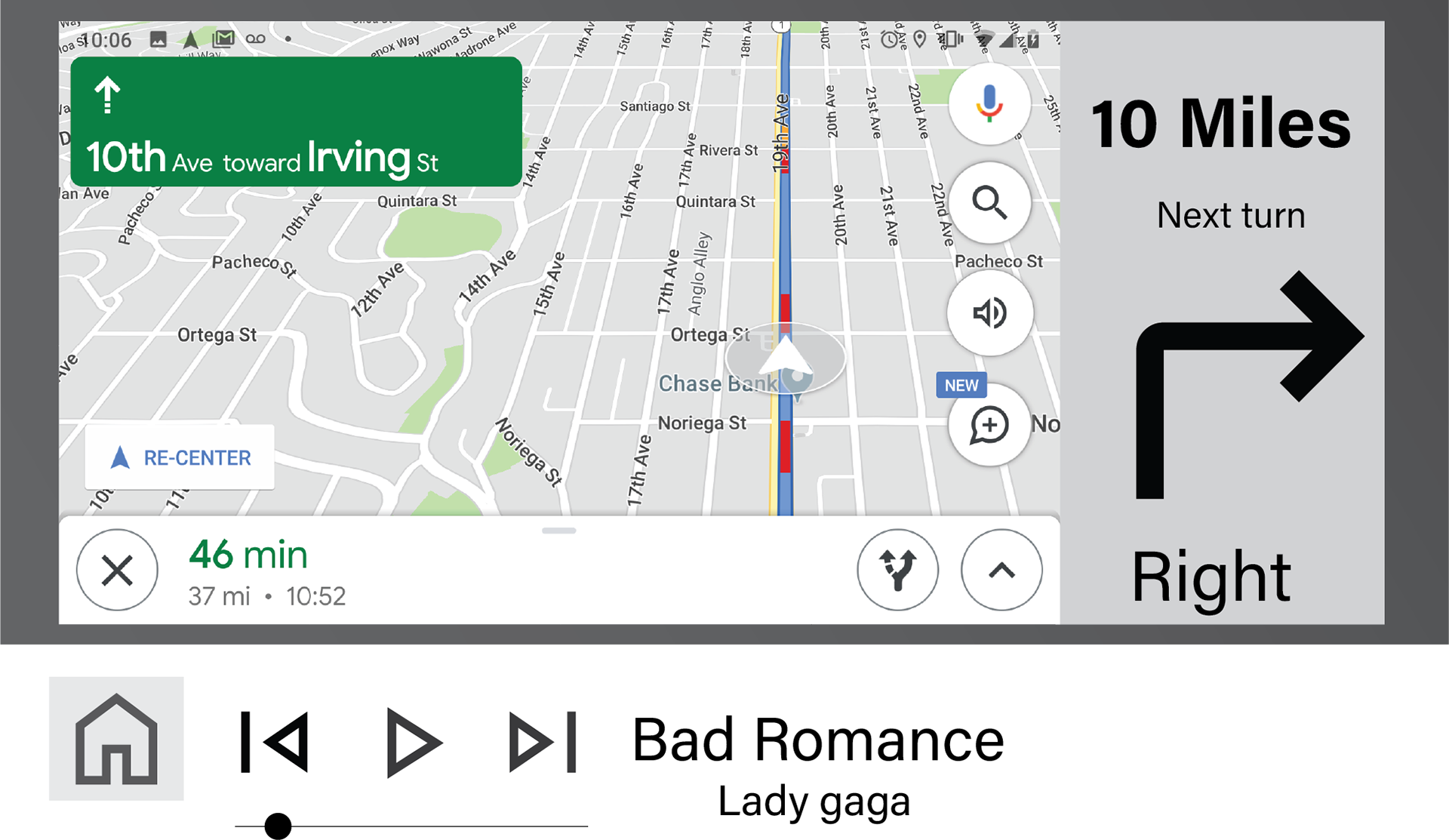
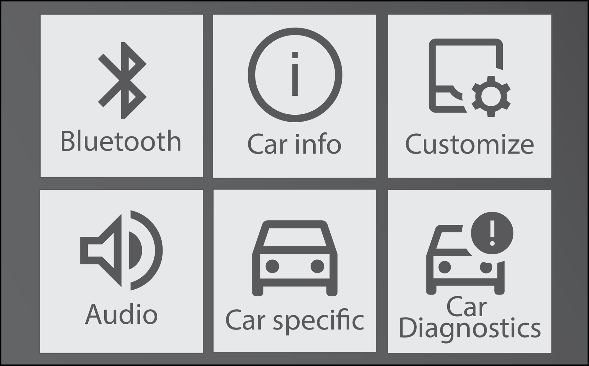
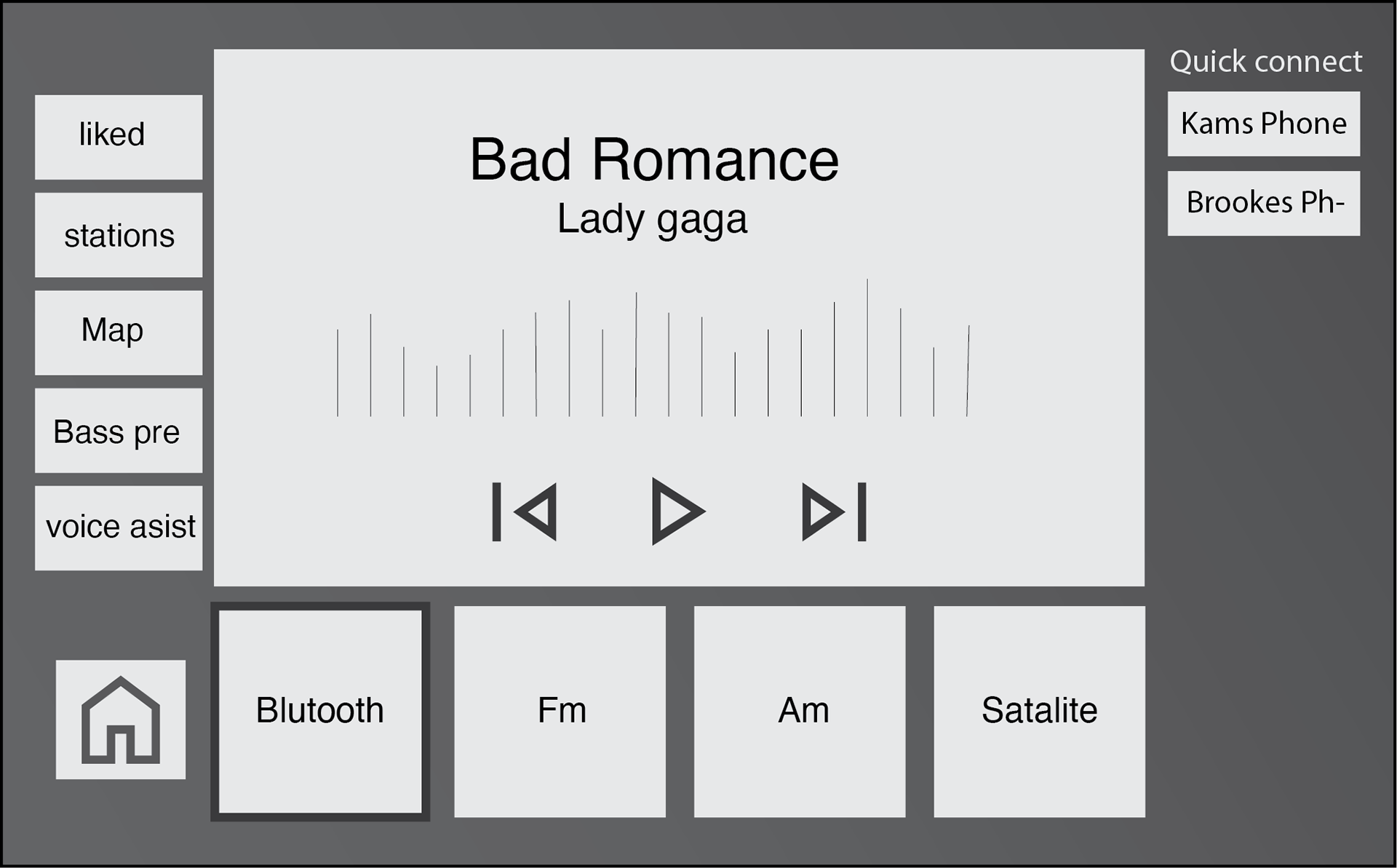
I got feedback that I should increase the contrast by making the background a dark grey tone. I also increased the size of the boxes and text to help with easy navigation and building muscle memory.
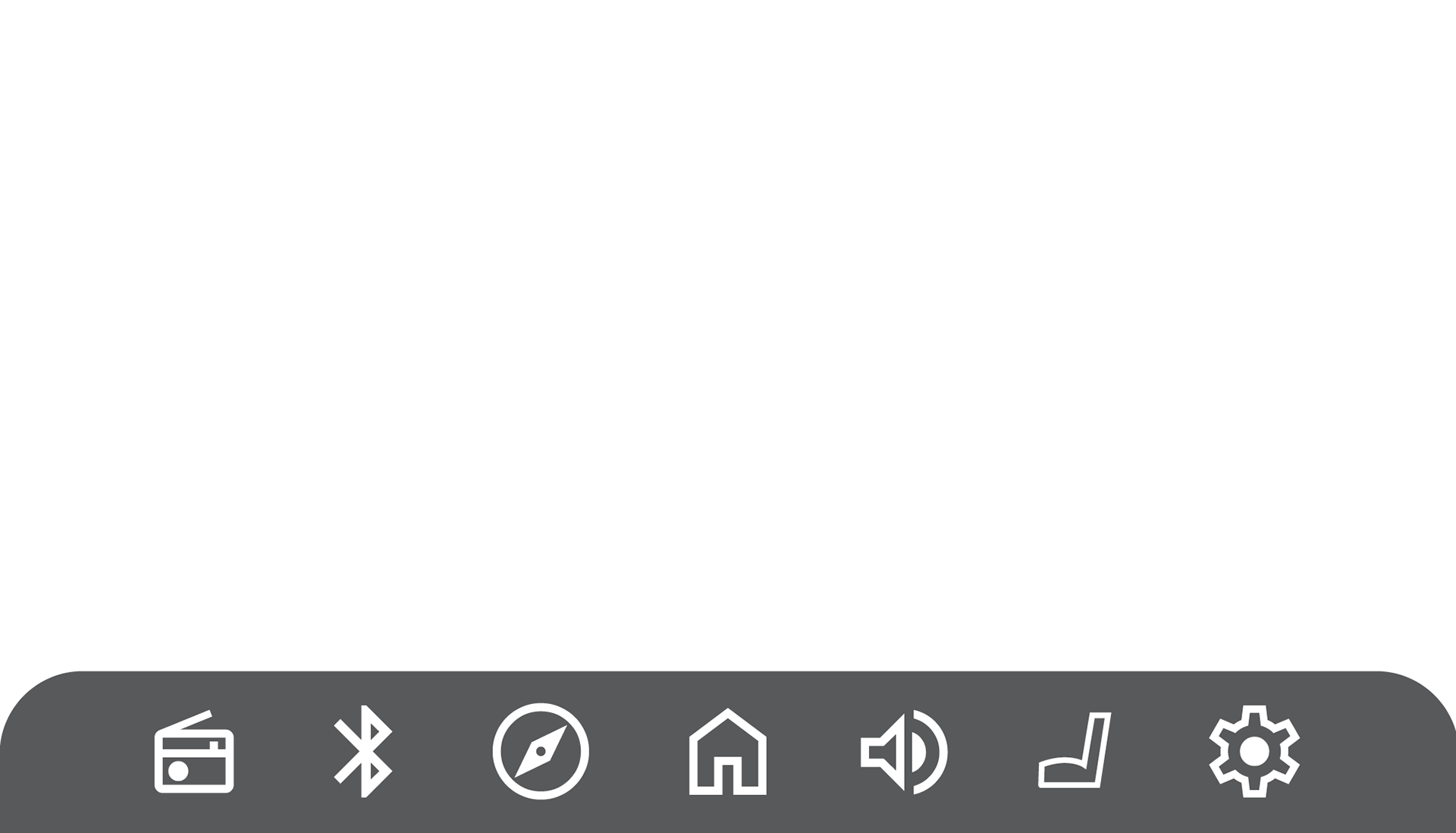
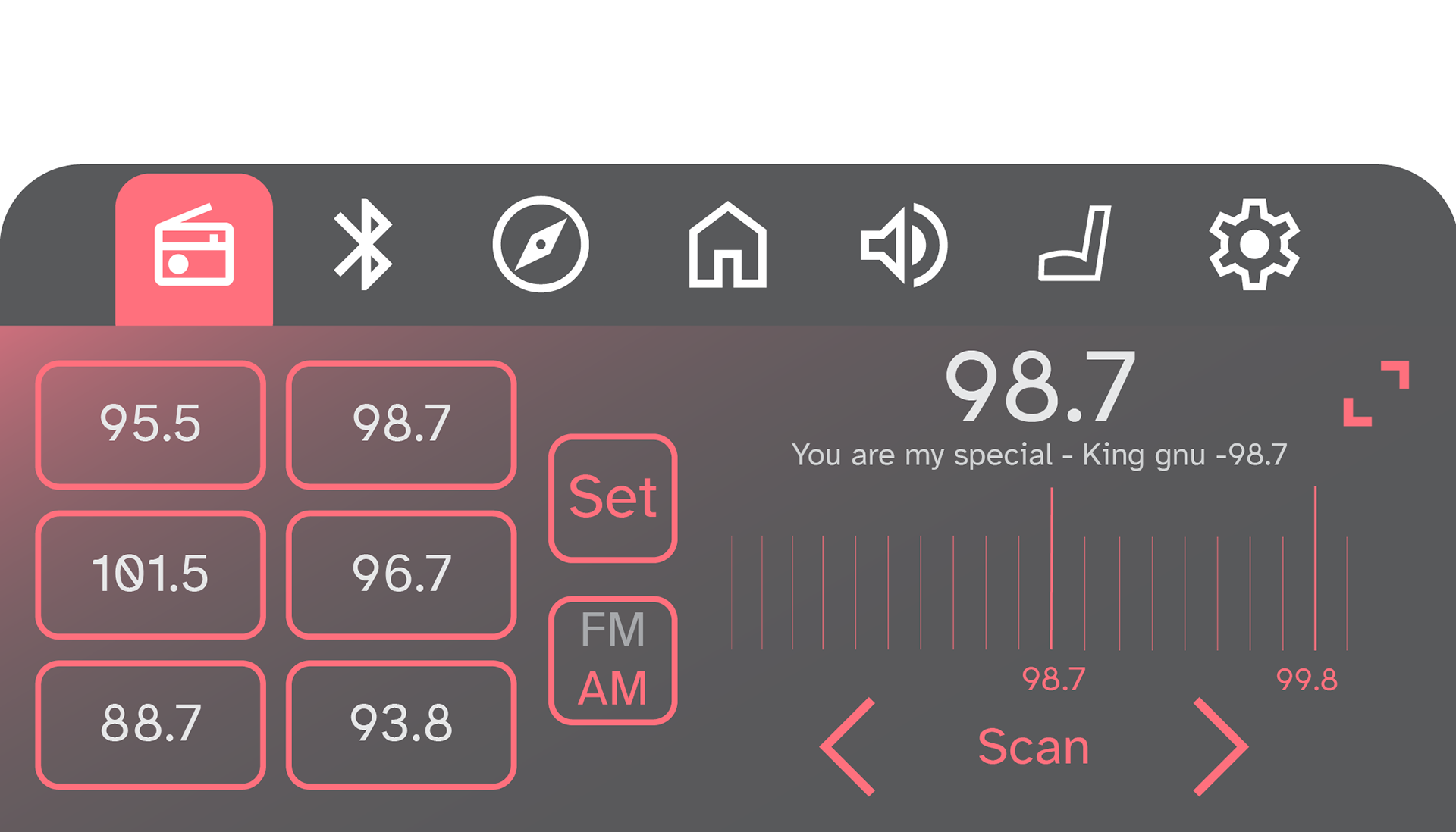
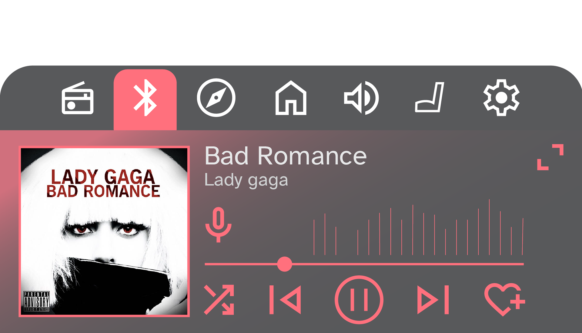
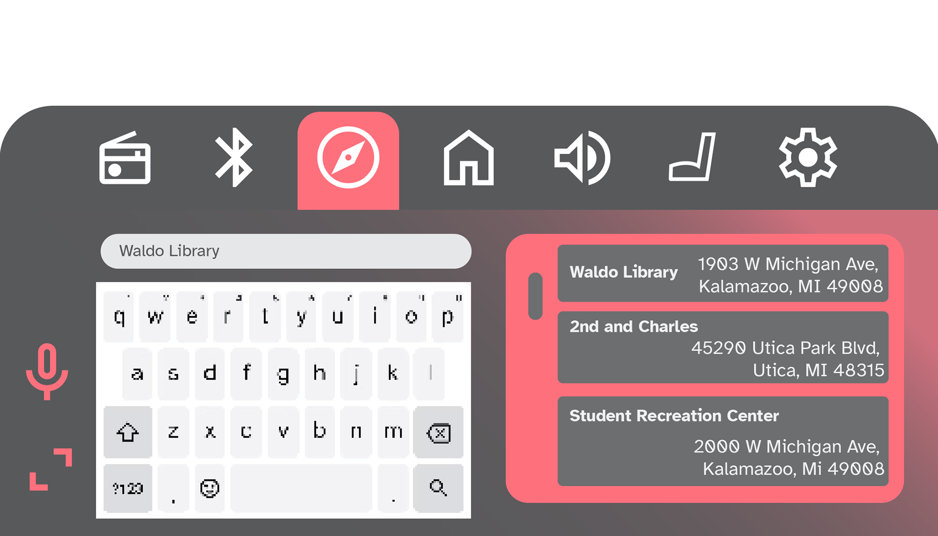
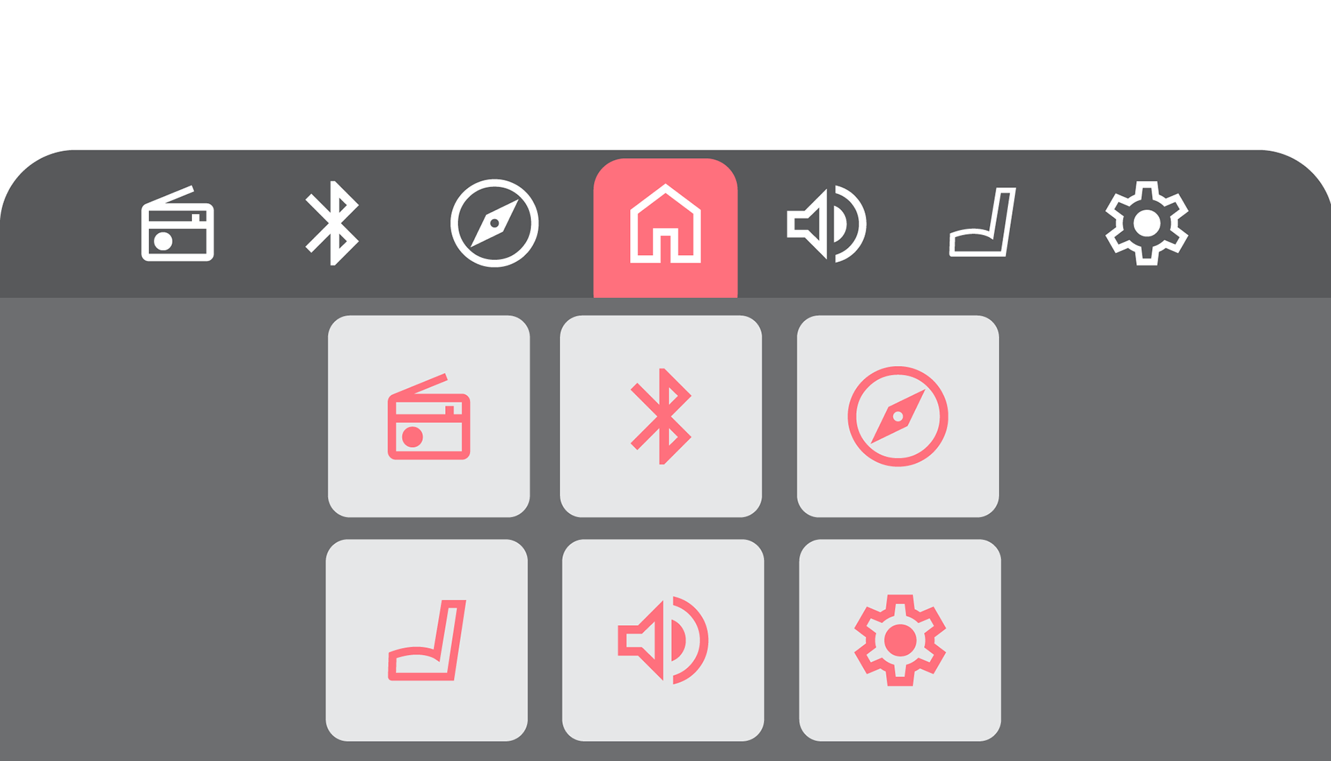
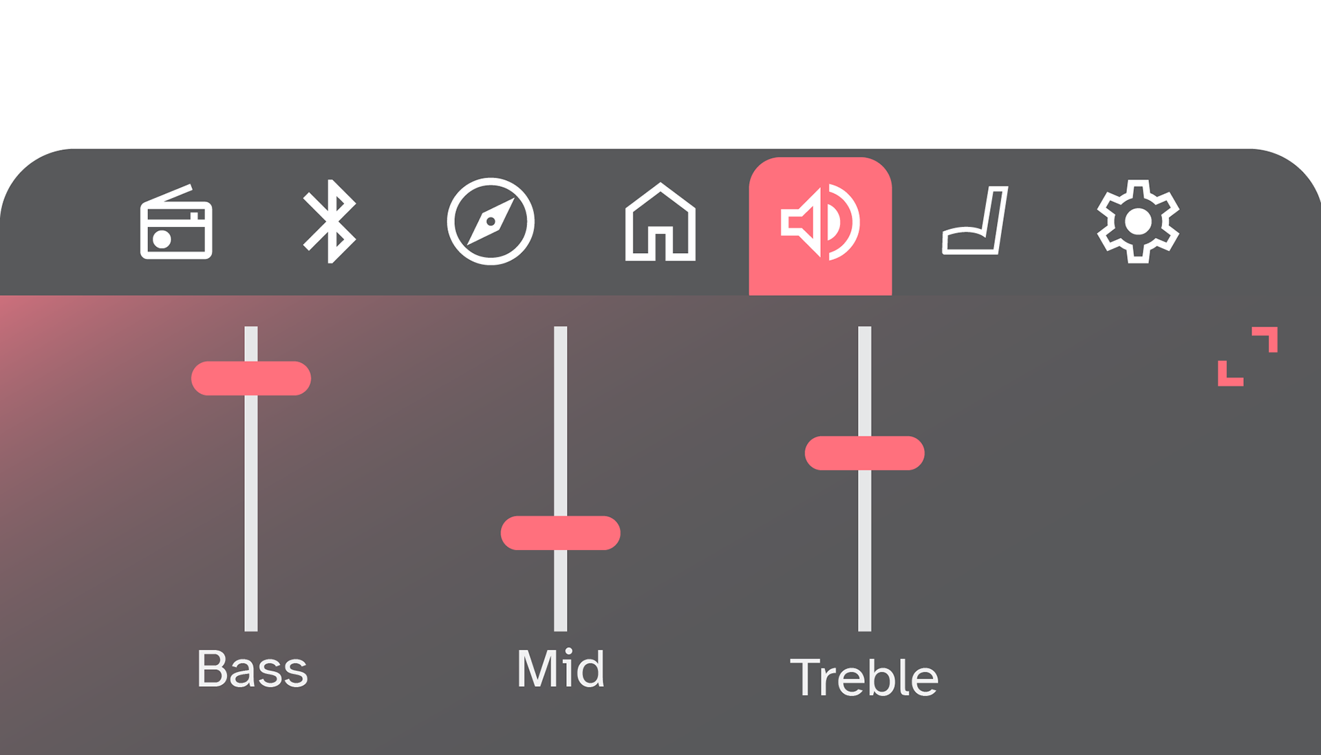
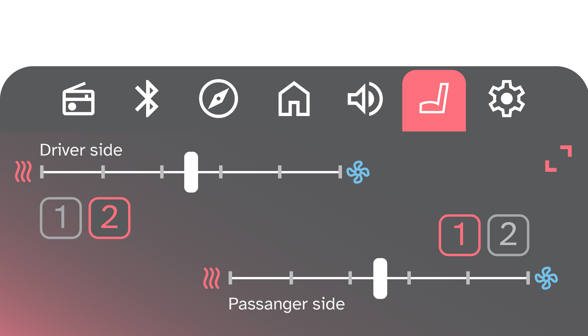
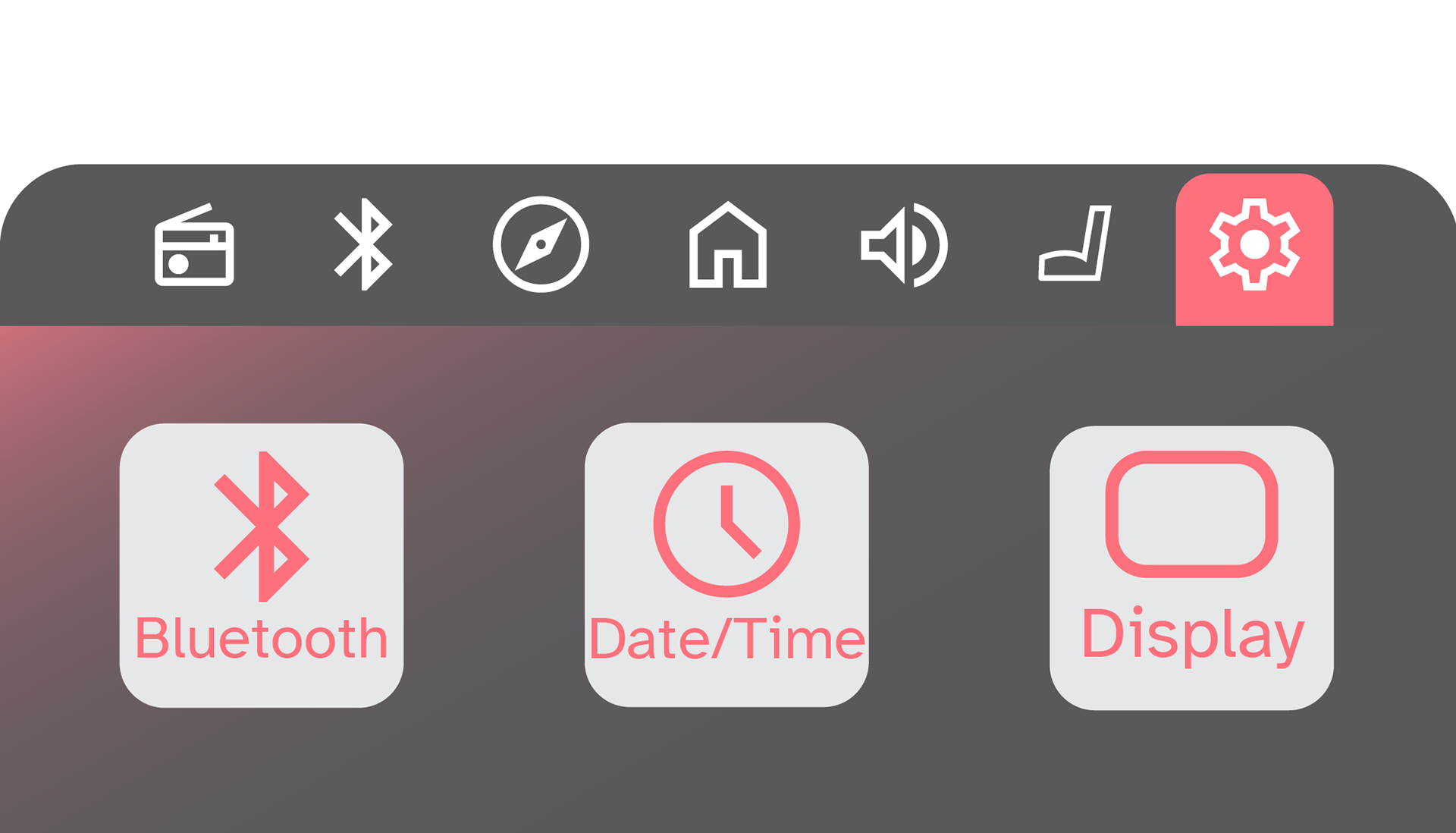
After a major critiques on my previous work I learned that I needed to change my approach when it came to the aesthetic of my Ui. So i went back to the board and designed a 2 layer system for my Ui. The front layer would be a pop up menu that would allow people to accesses quick controls. The back layer would be a permanent choice and expands options in the quick menu. By using two layers it help create a flow and early understood Ui. So I first tackled the pop up menu by taking what I learned in the previous Ui to condense it into a smaller menu.
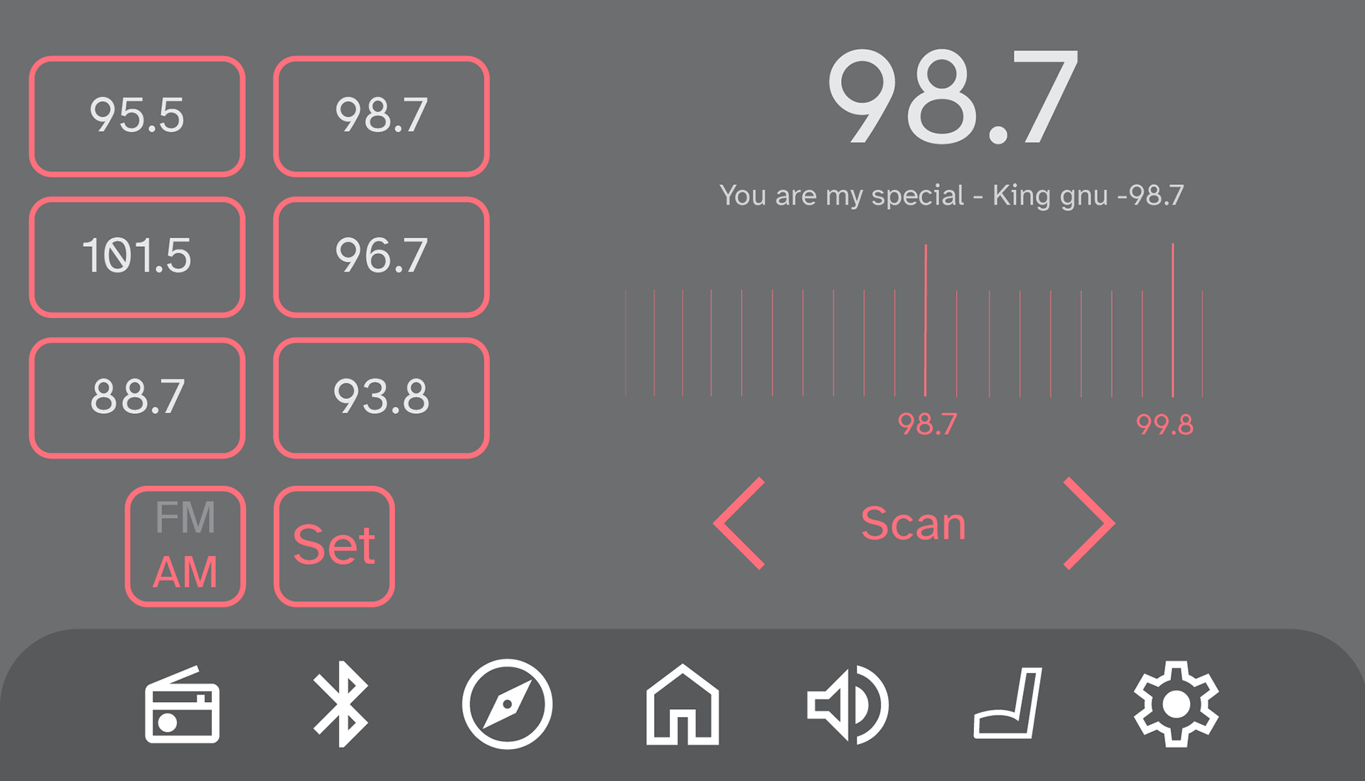
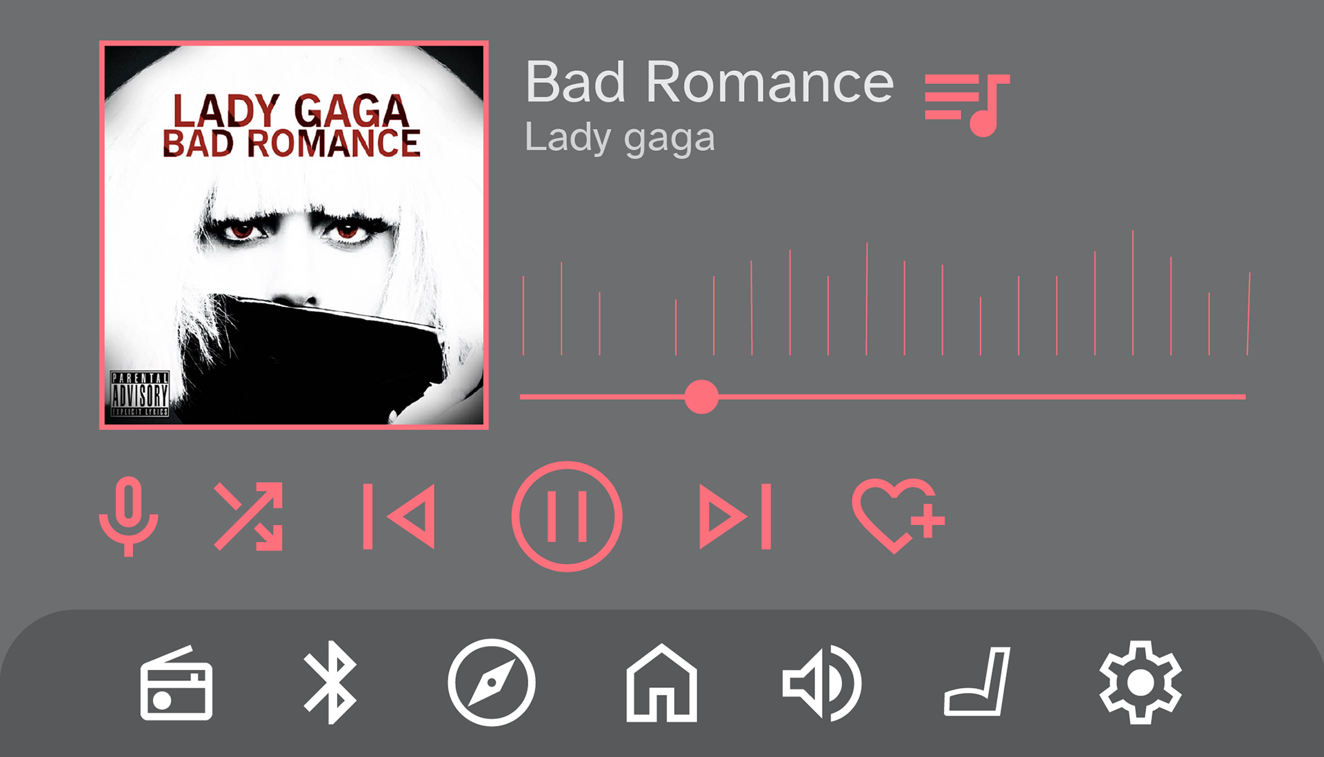
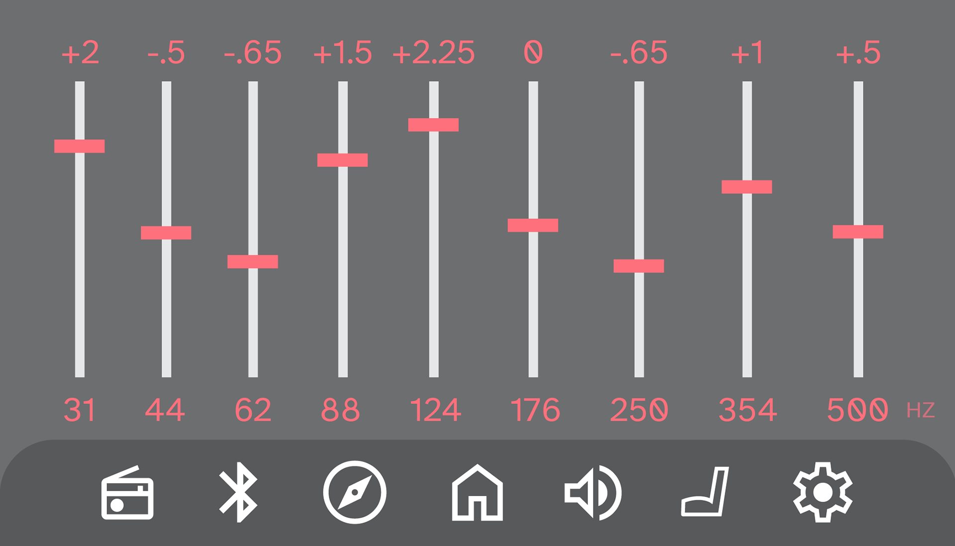
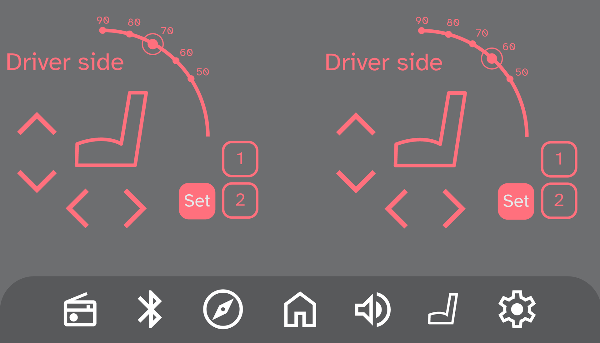
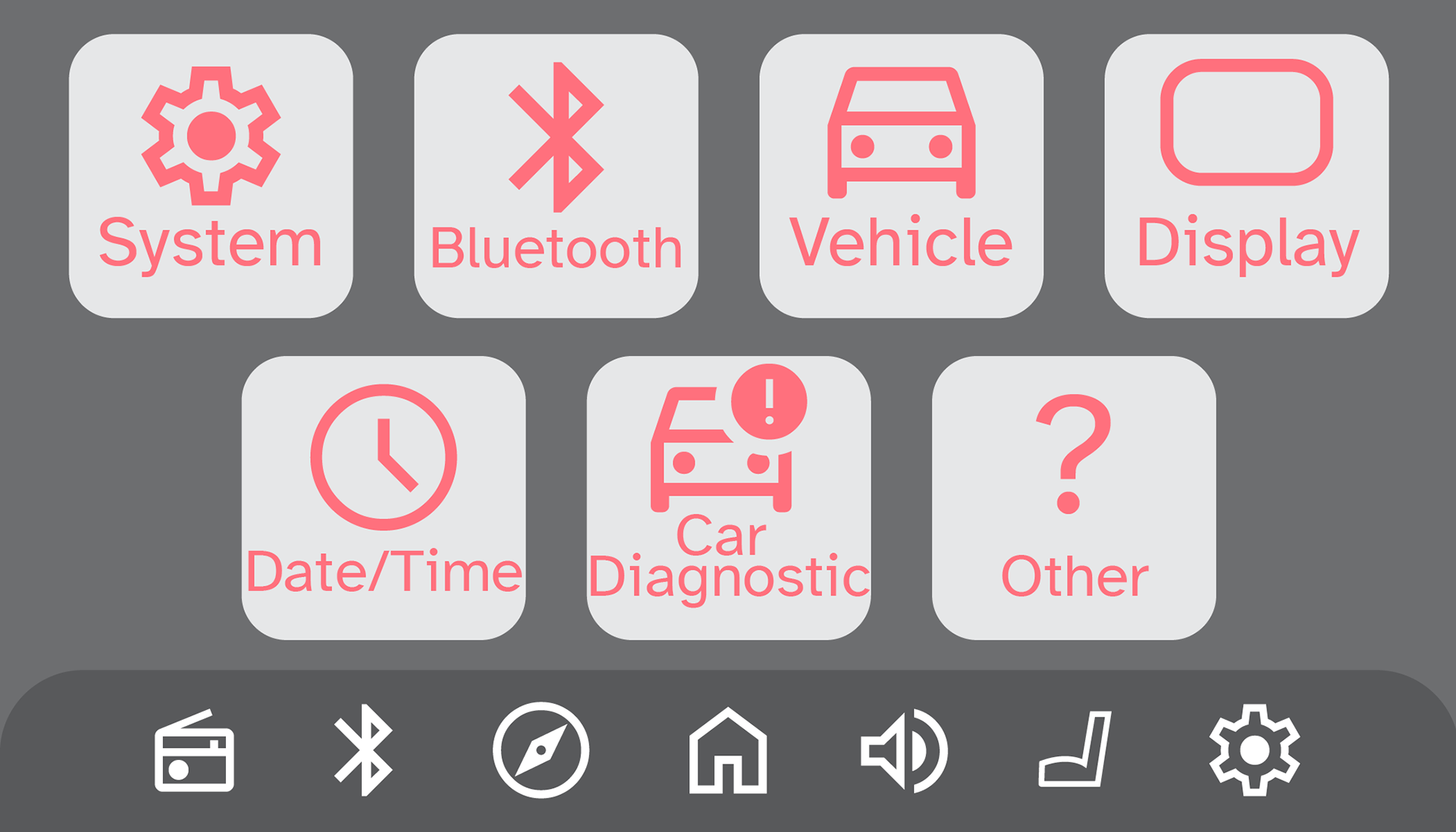
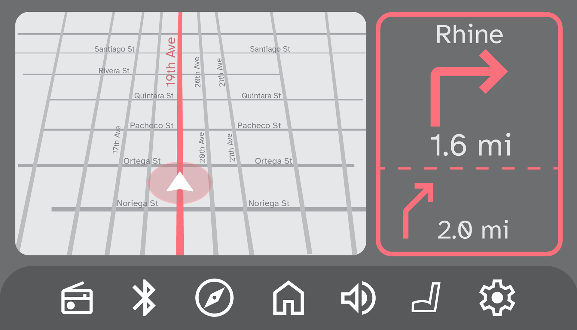
After creating the front layer I moved on to the back layer where I expanded the idea of the condensed front menu. This serves as a homepage that can be changed based on what the driver wants at the time.
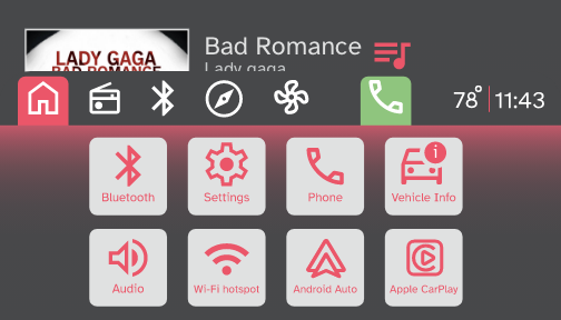
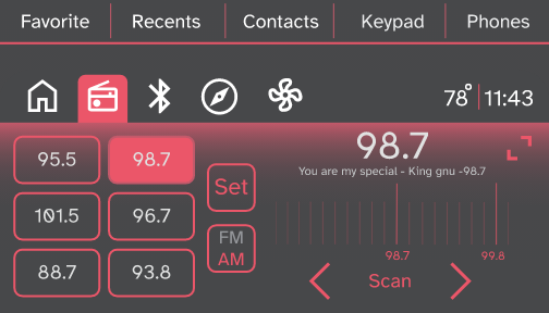
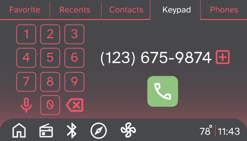
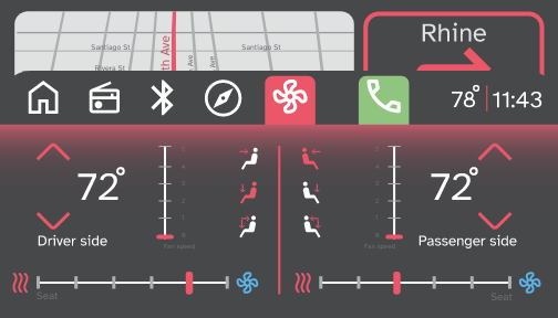


After some more revision and small tweaks I arrived at a final product I was happy with showing off. My next step was to make it usable, so I exported every screen combination to Adobe XD and rigged a working prototype of the UI.
By using a tablet the size of a car screen I was able to demo what the prototype would be like to use. I also created other color options for people to chose which color is easiest for the driver to see and use. ( This project was done within a 3 month time limit)