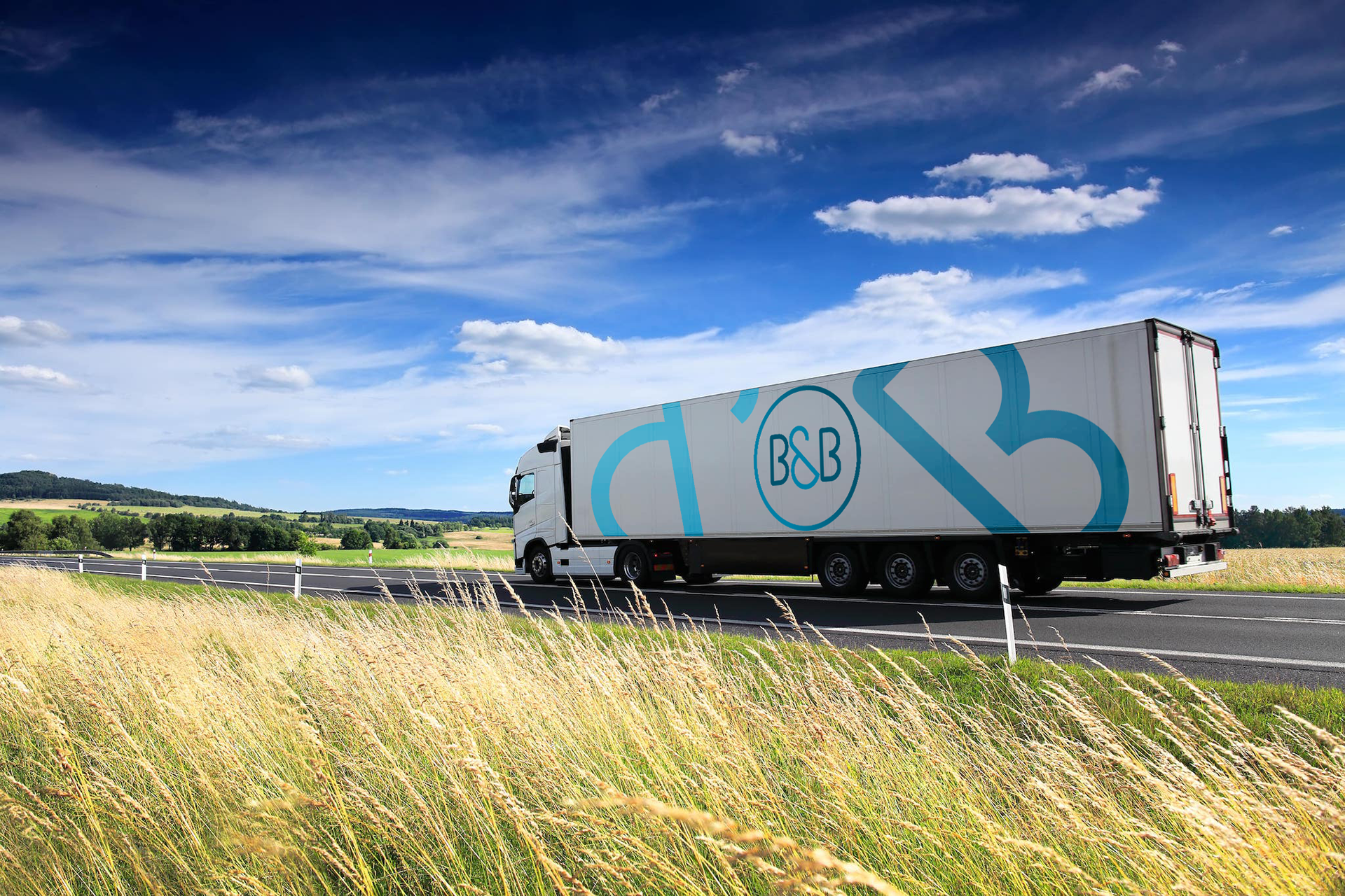
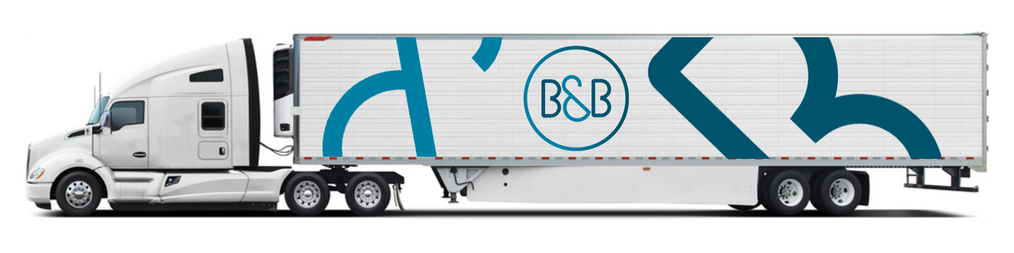
A brand refresh for B&B, a trucking company whose identity had grown dated and difficult to read; a busy color palette and an overly complex mark made the logo lose clarity at smaller sizes. The redesign pares the mark down to its essentials, rebuilt around Simplo, a custom typeface I designed in Illustrator using circular forms as the foundation for a more futuristic, modern feel. The result is a simplified, streamlined identity that holds up at any size while still nodding to the original logo it replaces.